
Helena SHRM Chapter
Brand Design
Helena SHRM is Your Resource for Leadership Development
Goal: Create a fresh new brand that reflects its mission and membership goals.
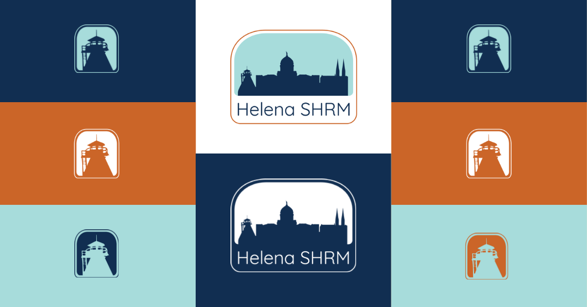
Work Completed: The Helena SHRM brand redesign included a primary and secondary logo and a smaller icon version for use as profile pictures on social media and smaller applications. The logo consists of local structural icons to differentiate this chapter from others within the state and portrays more inclusivity to other industries and professions than the previous design.
I carefully chose the colors to represent a professional attitude while portraying a friendly and approachable look.
Dark Blue represents professionalism and forward thinking.
Orange represents a sociable nature and positivity.
Teal represents fresh ideas and inspiration.
Outcomes: A redesigned brand that aligns with the goals and target membership Helena SHRM strives to attract.